
Inspired by the Chinese Kraak porcelain, the earliest Dutch Delftware closely followed its blue-and-white appearance. It was indeed the blue decoration that earned Delftware its popular nickname ‘Delft Blue’. But in the late seventeenth century, potters in Delft began to make earthenware that was painted in a range of colour patterns, adding red, green and even gold to the colour schemes. What was the reason for this change of colour palette? Was the blue and white no longer appealing to their clientele?
A lack of Chinese porcelain
Until circa 1645 the trade in Chinese porcelain by the Dutch East India Company (VOC) proceeded without problems, but from then on civil unrests in China brought imports of Chinese porcelain to a halt.
Not only the production in Jingdezhen stagnated, supply routes were also cut off.[1] Furthermore the Company lost their market bases, as Formosa fell into the hands of Chinese Ming adherents in 1661.[2] The directors of the VOC had recognised the impending lack of porcelain in time and began to search for alternative options in Japan.
Porcelain from Arita
Although ceramics were being made in the Japanese city Arita since the beginning of the seventeenth century, the domestic Japanese demand for porcelain was predominantly fulfilled by imports from China.
As the supply of Chinese porcelain also decreased strongly in Japan after 1645, there was a greater demand for the porcelain from Arita. Local production was further stimulated when the VOC started to buy porcelain of these ovens from circa 1655.[3]
The Japanese porcelain was primarily bought by the VOC for the company’s own use in Batavia or for trade in Asia and only alternately for trade in the home market.[4] Regarding the limited quantities they transported, it is clear that imports of porcelain from Japan could only have satisfied a small part of the demand in the Netherlands.[5]
Foliage in deep red and gold
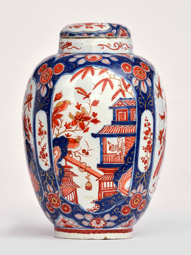
In Arita, the potteries produced both the blue painted wares and porcelain decorated with designs on top of the glaze in brightly coloured enamels.[6] This so-called Imari porcelain was named after the port on the island of Kyushu from which the porcelain made in Arita was exported.[7]
Imari was known for its rich decoration in deep blue and red with gold glazes. This was a colour combination that was not seen in China at that time. Traditional Ming dynasty porcelain was primarily decorated with the colours green and red, probably due to the scarcity of gold in China, whereas gold was abundant in Japan at that time.
The depicted scenes on Imari porcelain are diverse, ranging from people to foliage and flowers. It became highly sought-after in Europe from the 1660s onwards, and it consequently fetched high prices.[8]
Japanese colour schemes by way of Delft
Since Imari porcelain was exceptionally popular in the Netherlands throughout the whole of the eighteenth century, it is not surprising that the Delft potters tried to tap into a piece of this market.[9] Especially because of its scarcity, as it was only traded for a short period by the VOC due to the high prices as compared to the Chinese porcelain.[10] Therefore, soon after the first pieces of Japanese Imari porcelain arrived in the Republic, the coloured Delftwares were developed.
The Imari porcelain was an inexhaustible source of inspiration for the Delft potters and they produced a lot of faience in this style during a small period of time.[11]
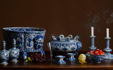
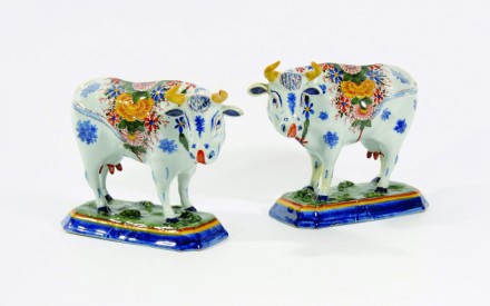
They used the Imari-style palette for all sorts of utensils, with which they responded to the latest fashion in the consumption of tea, coffee and chocolate.[12]Understandably, the Delftware with a polychrome decoration was far more expensive than the blue and white colour scheme.[13]
Asymmetrical decorations
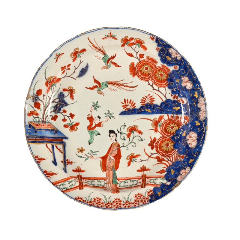
Although the Delft potters began to emulate these showpieces, they held on to their own Dutch (or the then familiar Chinese) interpretations.[14] This meant that the colours were directly inspired by the Japanese wares, but the forms and decorations were also inspired by European, mostly Dutch, objects.
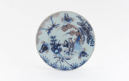
Typical for the Japanese decoration is the asymmetry: most pieces have a dark blue section on the right and an open scenery on the left. The open scenery is frequently decorated with a Long Eliza: an elegantly dressed oriental woman, who is often shown with playing children (zotjes) or watering a trough of plants in front of a garden fence (a detail which is derived from Chinese transitional period). Furthermore the Japanese colour palette has frequently been extended with a light green colour.
This article was previously published on the website of Aronson Delftware.
References
[1] Possibly the manufacture of export porcelain was then partially taken over by southern Chinese kilns that supplied previously mainly coarse porcelain. Nevertheless, deliveries were certainly not substantial and frequently enough which caused problems for the VOC since they found it increasingly difficult to meet the demand from the Netherlands.
[2] Jörg, C.J.A. Oosters porselein. Delfts aardewerk, Wisselwerkingen, Groningen 1983, p.9.
[3] Ibidem.
[4] Van Dam, J.D. Delffse Porceleyne, Dutch Delftware 1620-1850, Zwolle / Amsterdam (Rijksmuseum), 2004, p. 62.
[5] Ibidem.
[6] There were two types of coloured Japanese porcelain: Kakiemon and Imari.
[7] Schaap, E. Delft Ceramics at the Philadelphia Museum of Art, Philadelphia, 2003, p. 20.
[8] Van Dam 2004 (note 4), p. 62.
[9] Idem, p. 122.
[10] Jorg 1983 (note 2), p. 25.
[11] Van Rappard-Boon, Ch. Imitatie en inspiratie; Japanse invloed op Nederlandse kunst, Amsterdam (Rijksmuseum) / Tokyo (Suntory Museum of Art) 1992, p. 34.
[12] Ch. Lahaussois e.a. Delfts Aardewerk, Amsterdam 2008, p. 140.
[13] Van Aken-Fehmers, M.S, Eliëns, T.M., Lambooy, S.M.R. Het wonder van Delfts Blauw – Delftware WonderWare, Zwolle/The Hague (Gemeentemuseum) 2013, p. 15.
[14] Van Rappard-Boon 1992 (note 11), p. 34.
Add new comment
Only logged in users can post comments
Log in or register to post comments